Every so often we get a call or an email from a customer wondering why their print looks different to what they saw on screen, usually with files supplied in Adobe1998. If you’ve run into this, you’re not alone. It’s not necessarily a mistake, but it is about understanding how colour spaces behave when files move from camera to screen to print.
Here’s a breakdown of what’s actually going on in the sRGB vs Adobe1998 conversation…
Colour space vs colour output – two different beasts
sRGB and Adobe1998 are both colour spaces. They’re essentially mathematical models that define a range (or gamut) of colours your file can contain. Adobe1998 has a wider gamut than sRGB, meaning it can store more vibrant colours, particularly in the greens and cyans.
That sounds great, right? But here’s the catch: what your file can contain isn’t always what a printer can reproduce.
No matter where you go in the world each printer and paper combination has its own output gamut. Our RA4 printers (Chromira and Noritsus, used for traditional RA4 photo prints) have a colour gamut that sits somewhere between sRGB and Adobe1998. So when you send in a bright, punchy Adobe1998 file for photographic printing, it may contain colours the RA4 printer just can’t physically reproduce. That’s when you start to see colour clipping – usually in the form of blown-out blocks of colour or a lack of detail in vibrant areas.
The good news? You’ve got options.
3 ways to manage out-of-gamut issues
1. Soft proof your images
If you’re working in Adobe1998, the best way to prevent surprises is by soft proofing your files using our printer ICC profiles. This lets you preview how your print file will look when printed on a specific paper/printer combo and adjust accordingly before exporting. Please contact us if you would like to use our ICC profiles.
If you’re working in Adobe1998, the best way to prevent surprises is by soft proofing your files using our printer ICC profiles. This lets you preview how your print file will look when printed on a specific paper/printer combo and adjust accordingly before exporting. Please contact us if you would like to use our ICC profiles.
2. Choose fine art inkjet printing
If colour accuracy is non-negotiable, especially for landscape work, fine art photography, or highly saturated colour palettes – our Epson inkjet printers on fine art papers are the way to go. These printers have a much wider output gamut and can handle most of the colours Adobe1998 is trying to preserve.
If colour accuracy is non-negotiable, especially for landscape work, fine art photography, or highly saturated colour palettes – our Epson inkjet printers on fine art papers are the way to go. These printers have a much wider output gamut and can handle most of the colours Adobe1998 is trying to preserve.
3. Work in sRGB for simple workflows
If your work doesn’t lean heavily on bright, saturated colours – like studio portraits or school and sports photography. sRGB might be the better option. It’s a smaller gamut, yes, but it maps very closely to what the RA4 printers can reproduce. You’ll avoid clipping issues altogether if your workflow stays consistent from camera to edit to export.
If your work doesn’t lean heavily on bright, saturated colours – like studio portraits or school and sports photography. sRGB might be the better option. It’s a smaller gamut, yes, but it maps very closely to what the RA4 printers can reproduce. You’ll avoid clipping issues altogether if your workflow stays consistent from camera to edit to export.
Why we won’t ditch Adobe1998
While it’s tempting to suggest everyone just submit sRGB files to avoid possible headaches, it would mean leaving a lot of print potential off the table – especially for photographers chasing those intense greens, reds, or sunset tones. Adobe1998 gives your files access to colours that simply don’t exist in the sRGB space, and when paired with the right output (especially our fine art inkjet prints), those colours can really shine.
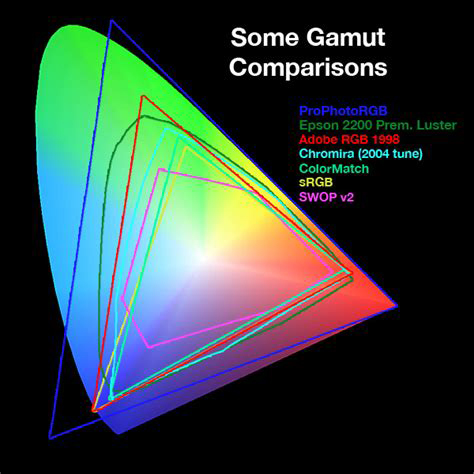
You can see what we mean in this visual comparison below.

(Image credit: Kevin Connery)
In the image above, the background represents the full spectrum of colours visible to the human eye:
-
Red line = Adobe1998
-
Yellow = sRGB
-
Dark Green = Epson inkjet printer
-
Cyan = Chromira (RA4 printer)
You can clearly see how much more the Epson can reproduce, and why we support both colour spaces depending on the job.
Still not sure which space to work in?
At the end of the day, the sRGB vs Adobe1998 decision isn’t about which colour space is “better” – it’s about choosing the right one for your workflow and your output. sRGB is simple and reliable, especially for photographers who just want consistency from camera to post production to print without overthinking it. But if you want to retain the widest possible range of colours your camera can capture – especially in highly saturated scenes, Adobe1998 gives you that flexibility. You just need to be aware that some of those colours may fall outside the printable range of RA4 printers. Pairing Adobe1998 with soft proofing or choosing fine art inkjet prints will help you get the most out of your files. Either way, we’re here to help you get the best results, no matter what you shoot.
Have questions or want to discuss further? Please get in touch.
Every so often we get a call or an email from a customer wondering why their print looks different to what they saw on screen, usually with files supplied in Adobe1998. If you’ve run into this, you’re not alone. It’s not necessarily a mistake, but it is about understanding how colour spaces behave when files move from camera to screen to print.
Here’s a breakdown of what’s actually going on in the sRGB vs Adobe1998 conversation…
Colour space vs colour output – two different beasts
sRGB and Adobe1998 are both colour spaces. They’re essentially mathematical models that define a range (or gamut) of colours your file can contain. Adobe1998 has a wider gamut than sRGB, meaning it can store more vibrant colours, particularly in the greens and cyans.
That sounds great, right? But here’s the catch: what your file can contain isn’t always what a printer can reproduce.
No matter where you go in the world each printer and paper combination has its own output gamut. Our RA4 printers (Chromira and Noritsus, used for traditional RA4 photo prints) have a colour gamut that sits somewhere between sRGB and Adobe1998. So when you send in a bright, punchy Adobe1998 file for photographic printing, it may contain colours the RA4 printer just can’t physically reproduce. That’s when you start to see colour clipping – usually in the form of blown-out blocks of colour or a lack of detail in vibrant areas.
The good news? You’ve got options.
3 ways to manage out-of-gamut issues
1. Soft proof your images
If you’re working in Adobe1998, the best way to prevent surprises is by soft proofing your files using our printer ICC profiles. This lets you preview how your print file will look when printed on a specific paper/printer combo and adjust accordingly before exporting. Please contact us if you would like to use our ICC profiles.
If you’re working in Adobe1998, the best way to prevent surprises is by soft proofing your files using our printer ICC profiles. This lets you preview how your print file will look when printed on a specific paper/printer combo and adjust accordingly before exporting. Please contact us if you would like to use our ICC profiles.
2. Choose fine art inkjet printing
If colour accuracy is non-negotiable, especially for landscape work, fine art photography, or highly saturated colour palettes – our Epson inkjet printers on fine art papers are the way to go. These printers have a much wider output gamut and can handle most of the colours Adobe1998 is trying to preserve.
If colour accuracy is non-negotiable, especially for landscape work, fine art photography, or highly saturated colour palettes – our Epson inkjet printers on fine art papers are the way to go. These printers have a much wider output gamut and can handle most of the colours Adobe1998 is trying to preserve.
3. Work in sRGB for simple workflows
If your work doesn’t lean heavily on bright, saturated colours – like studio portraits or school and sports photography. sRGB might be the better option. It’s a smaller gamut, yes, but it maps very closely to what the RA4 printers can reproduce. You’ll avoid clipping issues altogether if your workflow stays consistent from camera to edit to export.
If your work doesn’t lean heavily on bright, saturated colours – like studio portraits or school and sports photography. sRGB might be the better option. It’s a smaller gamut, yes, but it maps very closely to what the RA4 printers can reproduce. You’ll avoid clipping issues altogether if your workflow stays consistent from camera to edit to export.
Why we won’t ditch Adobe1998
While it’s tempting to suggest everyone just submit sRGB files to avoid possible headaches, it would mean leaving a lot of print potential off the table – especially for photographers chasing those intense greens, reds, or sunset tones. Adobe1998 gives your files access to colours that simply don’t exist in the sRGB space, and when paired with the right output (especially our fine art inkjet prints), those colours can really shine.
You can see what we mean in this visual comparison below.

(Image credit: Kevin Connery)
In the image above, the background represents the full spectrum of colours visible to the human eye:
-
Red line = Adobe1998
-
Yellow = sRGB
-
Dark Green = Epson inkjet printer
-
Cyan = Chromira (RA4 printer)
You can clearly see how much more the Epson can reproduce, and why we support both colour spaces depending on the job.
Still not sure which space to work in?
At the end of the day, the sRGB vs Adobe1998 decision isn’t about which colour space is “better” – it’s about choosing the right one for your workflow and your output. sRGB is simple and reliable, especially for photographers who just want consistency from camera to post production to print without overthinking it. But if you want to retain the widest possible range of colours your camera can capture – especially in highly saturated scenes, Adobe1998 gives you that flexibility. You just need to be aware that some of those colours may fall outside the printable range of RA4 printers. Pairing Adobe1998 with soft proofing or choosing fine art inkjet prints will help you get the most out of your files. Either way, we’re here to help you get the best results, no matter what you shoot.
Have questions or want to discuss further? Please get in touch.

